Tag Archives: Interior Designer – Dayton Ohio

South Park Kitchen Remodel

Before - South Park Kitchen
Before – South Park Kitchen
South Park Kitchen
South Park Kitchen

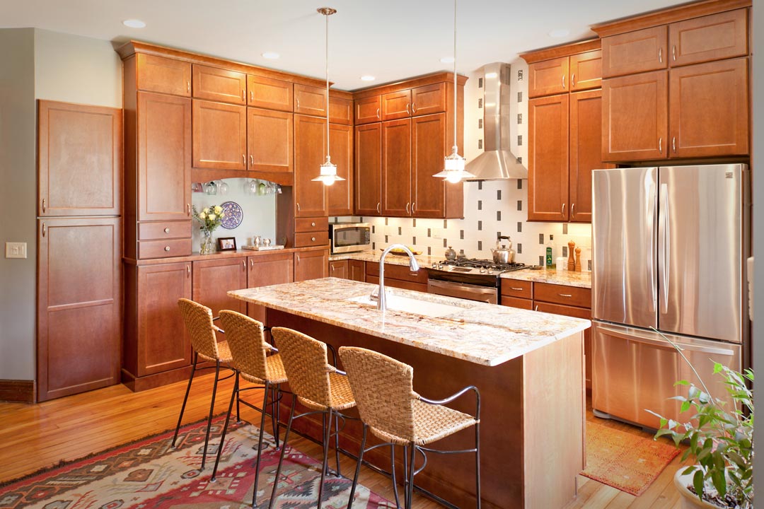
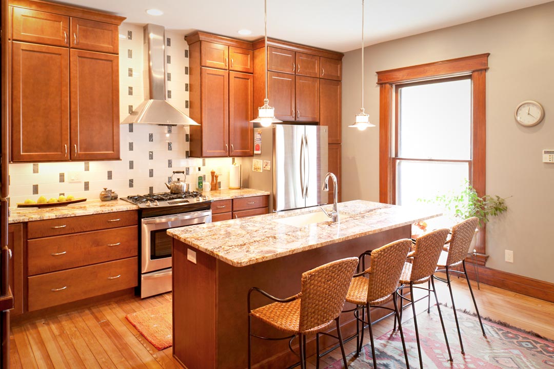
Some pretty dramatic changes to a kitchen renovation in South Park. The outdated kitchen had too many doorways and one extra large window that limited the cabinetry options in the previous design. Nest Designs LLC created a new floor plan that eliminated two doorways and one window. Removing those items allowed for a wall of cabinetry and a large amount of surface area on the counter-tops. The area to the left of the stove used to be a doorway that led to the outside of the house while the area to the right of the stove use to be a window.
Before - South Park Kitchen
Before –  Kitchen
South Park Kitchen Remodel
South Park Kitchen
South Park Kitchen

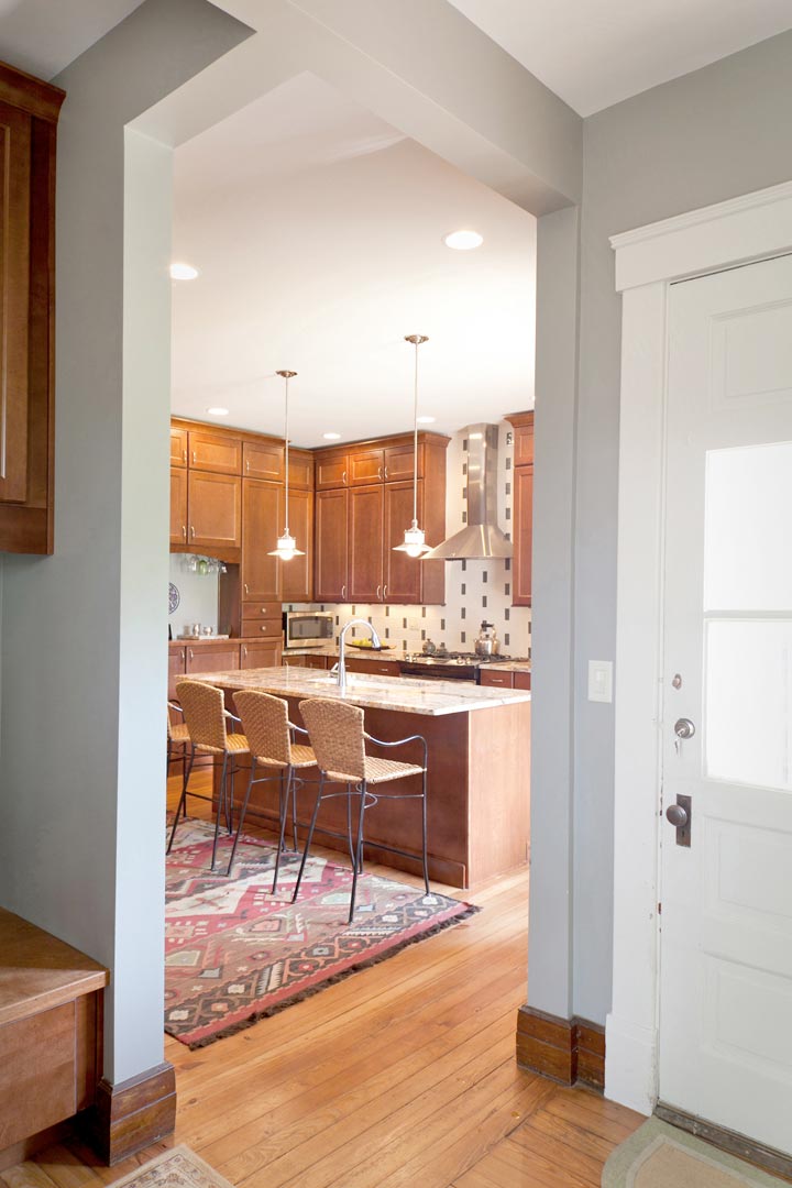
Repositioning the island and the stove helped create better flow in the kitchen. This historic home had 9′ ceilings and running the cabinetry the height of the ceiling added much needed storage, along with adding a lot of visual appeal. Notice the support beams above the opening that  lead into the mudroom and additional pantry (not  pictured). By opening up the doorway that had a very small passageway, we were able to make those two spaces more unified. It also allowed  for more natural light to flood into the kitchen. After photos by Bealer Photographic Arts.
Simms Patterson Square Condo – Upper Level

Master Bedroom
Master Bedroom

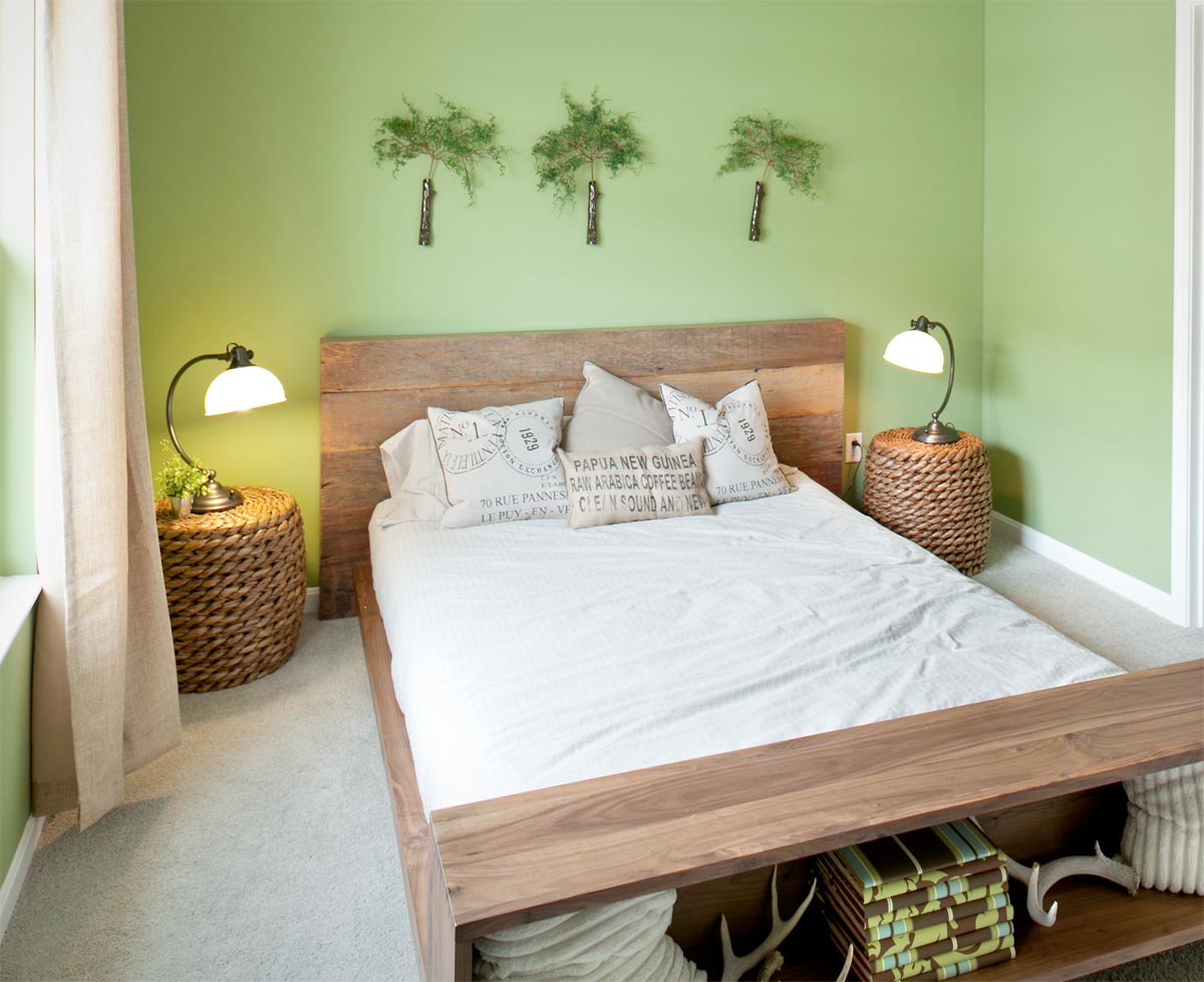
The upper level of the condo features two bedrooms, a bathroom, a laundry room and a linen closet. This picture is of the Master Bedroom. I chose a gorgeous green color for the wall, a queen sized bed with a rough, natural finish and two ottomans as nightstands. Soft natural bedding and pillows with text and texture give the bedroom a very comfortable and cozy feel. Photo by Nest Designs LLC.

Master Bedroom
Master Bedroom

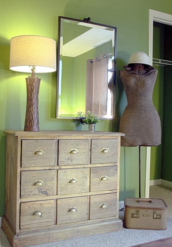
For fun I chose a dresser that was made from reclaimed wood. The lamp carries the wooden texture over from the bed. The dress form with the metal helmet and the vintage luggage add style and playfulness to the bedroom. Hanging the mirror on the vertical instead of the horizontal pulls all of the elements together. Photo by The Next Wave.

Bathroom
Bathroom

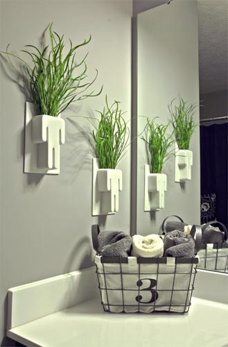
Here is an image from the bathroom. I’ve used the wall vases in the past in a bathroom and they were perfect for this space too. This time is used a green grass to add a punch of color against the gray wall color. The numbered basket is perfect for holding hand towels. Photo by The Next Wave.

Simms Patterson Square Condo – Living Level

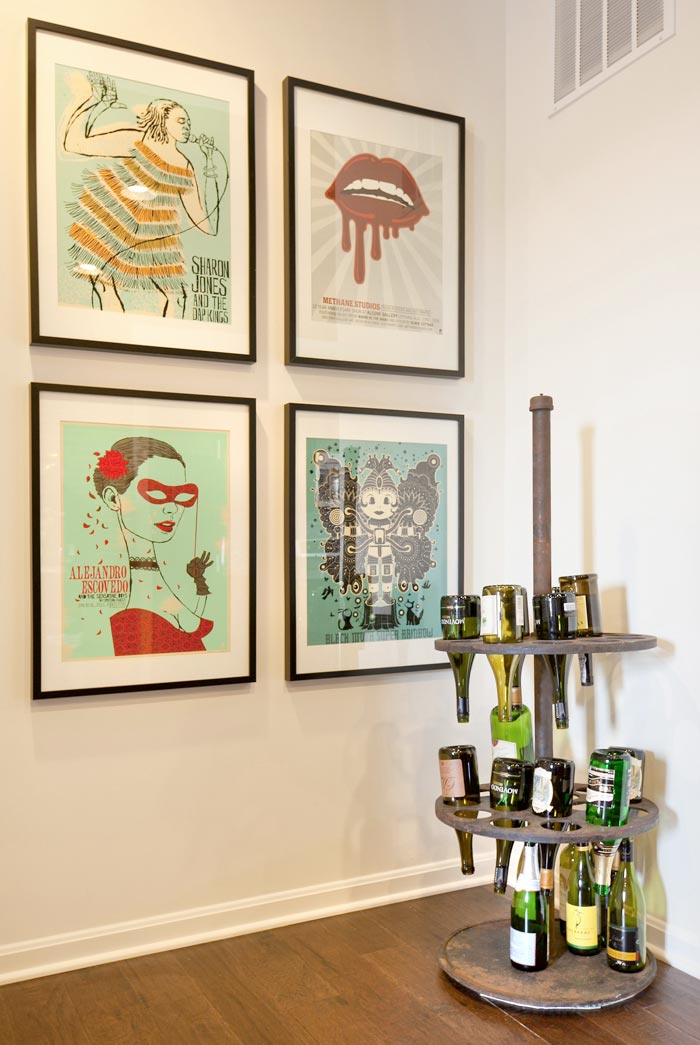
Wine rack with tour posters.

The main living area of the condo is located on the second floor. This image is of the wine rack located at the top of the landing. Nest Designs took an old industrial piece and converted it to a wine rack. Tour posters were framed and hung together to create a graphic statement on the back wall.  Photo by Bealer Photographic Arts.

Living area
Living Area

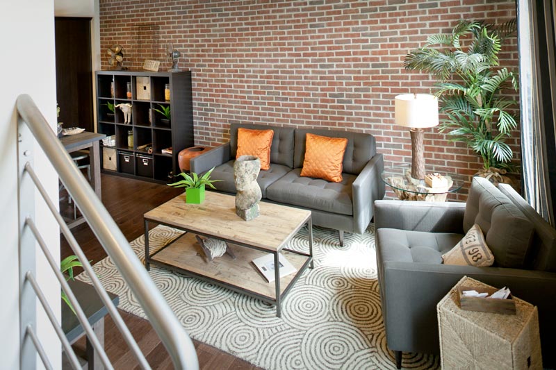
The living level is part of an open floor plan that blends the living, eating and kitchen areas together. This image focuses on the living portion. Notice how the brick wall, the patterned area rug and the grey tones in the sofa and chair add color and texture to this space. Photo by Bealer Photographic Arts.

Dining room table and cube storage unit.
Dining room table and cube storage unit

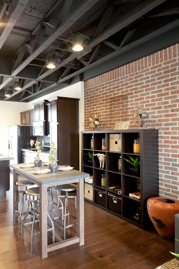
The dining area seats four comfortably. The brick wall in the background is the perfect compliment to the galvanized iron top on the kitchen table. The storage unit behind the table adds visual interest and storage at the same time. The metal stools spin to adjust the height. They are the perfect mixture of practical and functional seating with an urban feel. The kitchen area in the model already came with the gorgeous cabinetry. Nest Designs selected the finish color, the concrete counter-top, and the glass mosaic back-splash. Photo by Bealer Photographic Arts.

McPherson Town Kitchen

McPherson Town Kitchen

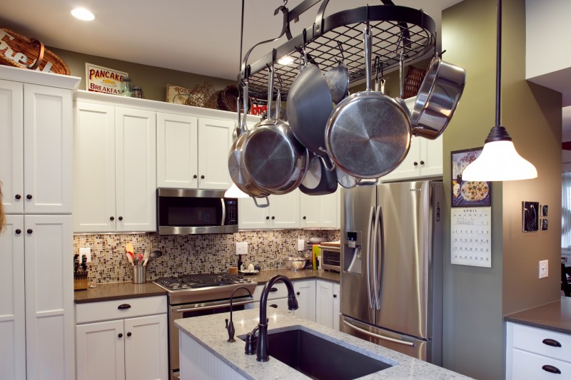
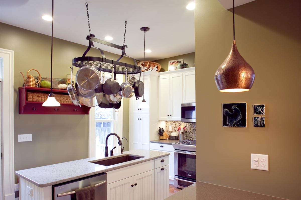
Prior to the renovation, there was a window in the wall where the stove is now placed. Removing that window allowed for a wall of cabinetry and a lot of added storage for the homeowners. The two contrasting quartz counter-tops and a fun glass mosaic back-splash gives those surfaces a punch of color and adds some visual interest along with some textural accents.

McPherson Town Kitchen

2011 DPVA Designer Show House

Before image of the Master Bathroom for DPVA Designers Show House 2011
Before image of Bathroom

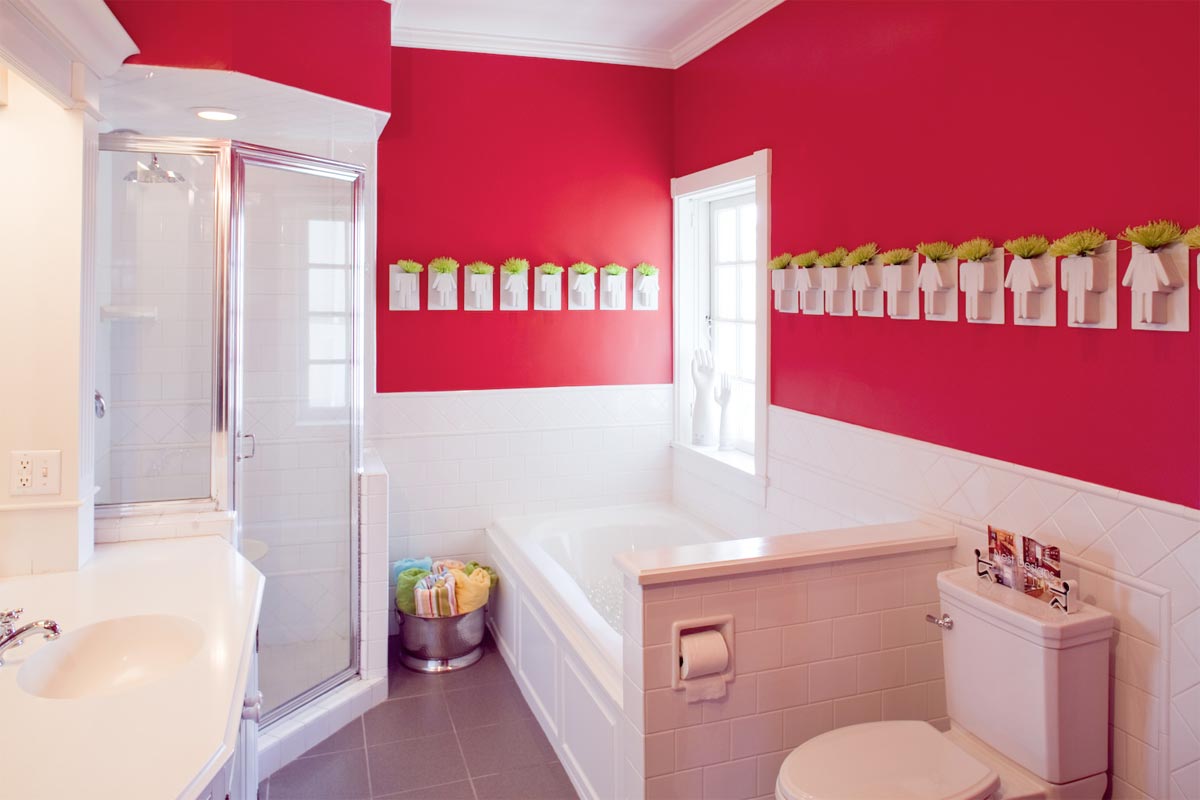
Nest Designs participated in the DPVA’s Designer Show House for the third consecutive year. At the end of the room selection process, I was fortunate to get the Master Bathroom. As you can see from the before image, the bathroom already had a nice layout. I decided to leave all the existing tile work, vanity, bathtub and flooring. I even kept the red walls but changed the shade of red to a more vibrant color for this space. As you can see from the images below a color change with some fun accent pieces can really transform a space.

Master Bathroom at the 2011 DPVA Designer Show House
After photo of the master bathroom

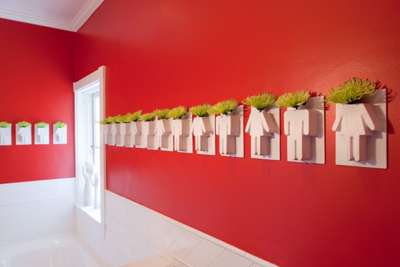
Here is the after photo of the Master Bathroom. Nest Designs changed the wall color to Sherwin-Williams Cherry Tomato SW6864. I found the man and woman wall vases online and knew instantly that they were going to be the focal point of the bathroom. I decided to hang them en mass on the walls. To add a punch of color, I added lime green spider mums. Those selections resulted in a space that was vivid, fun and energetic. Photos by Bealer Photographic Arts.
Wall vases
Close-up of the wall vases